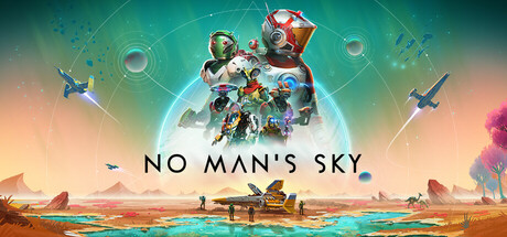
 The first thing I focused on when designing the logo was what it was for. I created concepts for the company's sci-fi game - Distant Traveller. An early sketch of the logo (and potential cover design) can be seen below. The premise of the logo was to be an anonymous traveller looking up at a sun in the centre, with a white streak going across it. I drew inspiration from games with similar design aestethics, such as No Man's Sky (1).
I added to this by making the streak actually pierce the star (which can be seen cracking at the points of impact). The traveller is dwarfed by the surrounding spires and rock formations, indicating geological patterns not native to an Earth-like planet. Early on, the first colour I experimented with for the design was a deep red of the sun, which would be instantly recognizable to someone as a star from a different place in the galaxy than our own.
Next, I cleaned up the sketched lines and produced a digital version of the logo. This version has the basic colour and indications of detail and shading. Some changes I made include making the sun bigger, and showing the fragments of the sun breaking off as if it were a solid entity. The landscape has been further structured and will show the light of the sun during the shading stage. I have also added a colour gradient for space and stars to show the presence of other suns in the galaxy.

A vast improvement can already be seen from the concept sketch, and it is possible to see what the final logo will look like from the above concept. Working with my friend who commissioned me, I present him these production concepts and continue with them if they are thought to convey his original idea. If any elements need changing, I can do so as it is easy to do so in a digital format.
Although this work experience commission is only for development of the logo, there is a possibility of me staying at the company for more pre-development work. This commission gave me a taste of development of ideas, working with a project partner, and being able to recieve and work around critical feedback for my concepts.
------------------------------------------------------------------------------------------
(1) No Man's Sky promotional art - Hello Games. (2016). [image] Available at: http://cdn.akamai.steamstatic.com/steam/apps/275850/header.jpg?t=1457021504 [Accessed 11 Apr. 2016].


